On July 12, 2016, the owners of the two oldest coal-burning units at the Colstrip power plant in Montana announced a settlement agreement with conservation groups to phase the units out of operation by 2022. It was the culmination of an effort almost a decade in the making – and even longer if you take into account the full scope of the plant’s checkered 40-year history.
It was a historic outcome for the second biggest power plant in the West. And for advocacy groups like the Montana Environmental Information Center, which had worked hard fighting the plant and its pollution for years, it was important to have the story told in a context that wrapped in the litany of problems that had plagued Colstrip and its owners throughout its operational life.
But given the realities of modern news coverage, it’s next to impossible in a press release to build a complex narrative that, in addition to the nuts and bolts, weaves in multiple layers of narrative. Against this backdrop, the last thing that MEIC and others involved in the years-long effort to retire the plant wanted was a simple story framed in the context of their lawsuit forcing Colstrip’s closure.
Enter the internet and a new twist on an old way of telling stories: the online timeline.
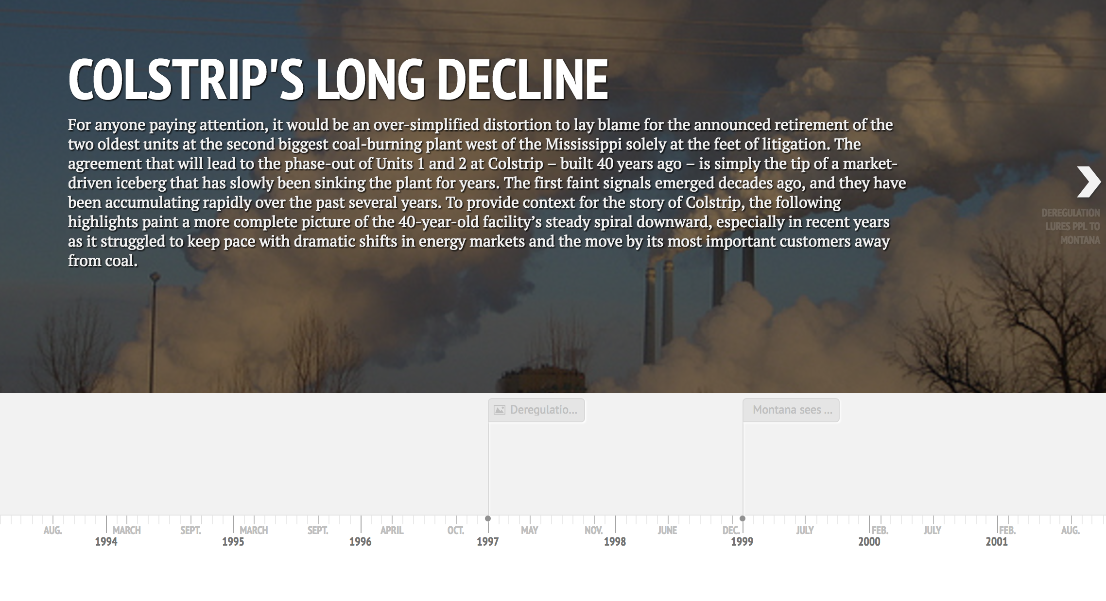
Working with MEIC and the Sierra Club, Resource Media compiled a lengthy fact sheet that started with the plant’s beginnings in the 1970s and walked through the sad details of coal-ash contamination, deregulation and soaring bills, and ending with the spiraling economics of coal-fired power and the real undoing of Colstrip.
We knew the material we put together was compelling. But we also knew the amount and complexity – about two dozen noteworthy developments over four decades – was far too much to cram into a background fact sheet, even in a condensed format. The online timeline solved that problem for us: http://bit.ly/Colstrip-timeline.
Knight Media Labs provides a free, relatively easy-to-use, web-based timeline generator. Key events are entered in an online google spreadsheet, and through web publication, the tool builds a visually compelling timeline. Images, graphics, video, audio and hyperlinks are all easily integrated – with the latter requiring only a basic understanding of a few html commands – and the presentation is clean and easy to navigate.
The beauty of the online timeline is that it provides a scalable way of telling a compelling story, from 30,000 feet up looking at the big picture down to zeroing in on the ground-level details of individual events.
The visual appeal also can’t be understated. A map of contamination plumes at Colstrip showed the extend of pollution not just at the plant site but also moving into the community. Video of the demolition of smokestacks of one of Colstrip’s sister plants hammered home the idea that there is eventually an end to the useful life of a power plant. An Image of the smiling CEO of one Colstrip’s out-of-state owners put a real face on quotes about the plant’s fate. Graphics showed in stark terms the sinking economics of coal.
Any one of these stories alone was another straw on the camel’s back. Combined into a timeline with strong visuals, they painted a bleak picture of a plant whose trajectory toward early retirement was inevitable.
The groups working on Colstrip found the piece invaluable, and not just for media purposes. The Sierra Club used the piece as an educational tool for its advocates and for utility regulators and legislators who will be weighing in on the mechanics of Colstrip’s retirement. It provided a cohesive beginning-to-end summary of the plant’s history. The Sierra Club, which share the timeline with Washington utility regulators, called the timeline “an outstanding visual piece chalk full of great information. I will send this to a variety of stakeholders and allies. Thank you.” 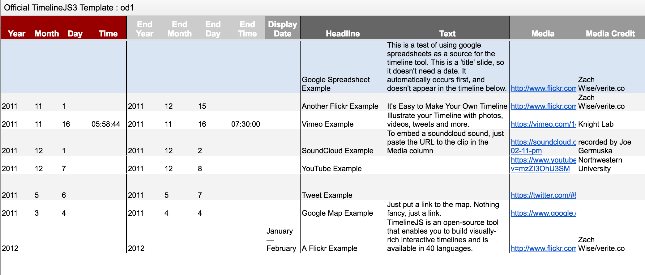
We compiled a similar timeline last summer in advance of the Department of the Interior’s decision to halt the federal coal-leasing program, another complex story with many layers.
If you’re considering making an online timeline, we’d highly recommend the Knight Labs Timeline tool, both for the ease of entering information and the appealing, easy-to-use navigation. There are a number of other options available, though.
The iSpring Suite of apps includes a tool creating interactive timelines. It’s free and integrates images, audio, video, and hyperlinks. However, it is compatible only with Windows, and you will have to download the application to your desktop. Timeglider, like the Knight tool, is an online app, although with limitations on the free version. It puts more emphasis on the dateline and less on the visuals and text, which at least in our estimation decreases some of the storytelling power. Microsoft Office offers a Timeline add-in for PowerPoint, with both a limited non-professional version and full-feature plus edition for about $50.
Take some time and experiment. Whichever option you choose, we’re sure the storytelling capabilities provided by online timelines will be worth it.