When you buy a product or service you can mostly get what you want, right? For instance, with a new car purchase you can prioritize things like gas mileage, safety or other features in accordance with your values and needs. Now what about your home’s electricity — is your money mostly going for energy you prefer? Is the power coming through your wall outlets mostly from coal and gas, or wind or solar? As a consumer, do you get to have some say in that?
In many cases it’s not so easy to find out where your home’s power comes from, and even harder to have a voice. Many utilities don’t tell customers their generation mix, and decisions about energy sources are often made in complicated regulatory or policy proceedings. We know from opinion polling that the large majority of voters across party lines in the U.S. strongly and consistently prefer more emphasis on clean energy from solar and wind rather than fossil fuels like coal, and certainly there’s been a lot of progress in that direction. However, it’s also the case that many utilities are still prioritizing coal and gas for the vast majority of their generation.
So what if electricity consumers had an easy and interesting way to see where things actually stand now — how the current energy mix for their home compares with their own energy preferences and values? That’s the idea behind the PicMyEnergyMix web app we created in 2015 and launched with clean energy advocacy groups in Michigan and Colorado. Conservation Colorado expressed the essence of the idea nicely in their blog post about the tool: “Imagine if we, the consumers, could decide for ourselves what kind of energy we use.”
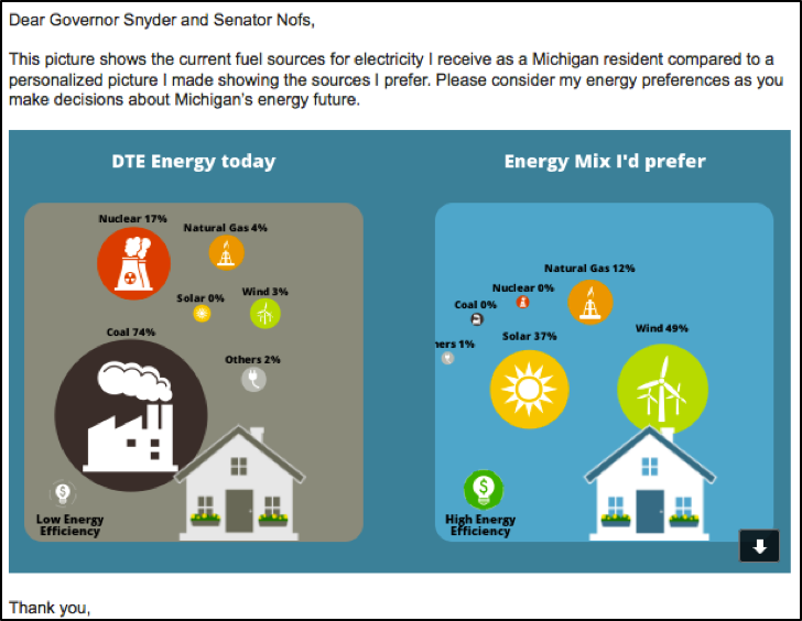
So here’s how it works: Resource Media works with local groups to customize PicMyEnergyMix for a state, including accurate data on local utilities. At the site, you select your utility, see a picture of your current energy mix, move sliders to show the mix you prefer (including energy efficiency) and submit your views to shape a statewide average picture of what customers want. Check out the one created by nearly 1,500 Michiganders here. You can also email your picture to a decision-maker, share it on Facebook, and Tweet about it. Here’s an example of a Michigan PicMyEnergyMix participant’s email share, which includes the personalized picture they made using the tool:
At Resource Media we’re always looking for ways to be visual in communications, and juxtaposition of contrasting images side by side is a good way to make an impression. Because it’s quite different from the typical online petition or mass email campaign, PicMyEnergyMix can also catch the eye of reporters and bloggers, providing a hook for attention to public demand for broader and fuller progress on energy transition.
Check out this short slide deck for a complete overview of PicMyEnergyMix and results from running it in Michigan and Colorado. If you live in one of those two states, you can try it out for yourself here (MI) or here (CO). Special thanks to Agentic Digital Media for website development and to Conservation Colorado and the Clean Energy Now campaign in Michigan for working with us to run PicMyEnergyMix outreach. We look forward to bringing the tool to more places in 2016 — let us know if you’re interested!