A recipe for smart science communications
We all know that good science is one of our most important tools in driving smart policy change. But facts alone can be dry, boring, and completely unconvincing. How, then, do we make sure our messaging makes the science sing?
Our new tipsheet, “Best Practices on Communicating Science,” offers an eight-point checklist for delivering hard science with a dose of emotion, from catchy one-liners to relatable metaphors. Resource Media’s Liz Banse has assembled ideas from the science of communications to help all of us—from scientists to poets to poet-scientists—combine stories, photos, graphics and facts to create compelling messages sure to sway the most cynical of skeptics.
Download your copy of this tipsheet here.
Lead with your results
- Start with what’s new, what’s most important: Scientists are trained to discuss their work starting with the background, how they got to their conclusions. But, this is almost exactly the opposite of how news is presented, and how most people think. Put your conclusion first, and clearly spell out what the results mean for your audience’s lives and concerns.
- Come up with catchy one-liners: Make yourself quotable. Come up with one or two catchy one-liners about your research and commit them to memory ahead of time; e.g., “Cutting down the rain forest for money is like burning a Rembrandt to cook soup.
- Avoid qualifiers, focus on what is certain: Talking about what you don’t know creates an opening for opponents and the media to attack and question the entire foundation of your research. Simply assert what you do know and what those conclusions mean. Say what you can as strongly and clearly as possible.
Apply science to your message
- Lead with values, not science: While facts matter, humans tend to rely on our feelings, emotions, values and cultural cues more. Find common ground with your audience first, connecting around shared values to open their mind to your science message.
- State the clear and present danger: After you have found common ground, then and only then, shift to the science. Detail the threats we face that are observable to the audience. Avoid talking about the future and focus on the here and now as our brains favor immediate over long-term planning.
- Make the message relevant and personal: When describing your science impacts, make them as personal and localized to your particular audience as you can.
- Highlight scientific consensus: Research shows that informing people that the overwhelming majority of scientists agree on the existence or the severity of an issue increases support for policy. This is the case for audiences across the political spectrum.
- Close with a solution: After you have captured your audience’s attention by describing the threats, pivot away from the fear-based message by closing with a solution. Research shows that you can overcome even science skeptics if they agree and like the solutions you present. And humans are an optimistic species and need hope to stay engaged with tough issues.
Choose a trusted messenger
- Recruit culturally-appropriate spokespeople: Choose a messenger that has credibility with your audience. Ideally it should be someone with a local connection to the issue. Even better if they have a personal experience to share (we all ask ourselves, what’s their skin in the game?). By tapping spokespeople who are members of the social/cultural community with whom they are communicating, the audiences will be more open-minded to considering the information.
Use accessible language
- Use plain, conversational language: Use words to help your audience “see” and “feel” what you are saying. Use the most basic, elementary forms of a word – one that people use in conversations with their family or neighbors. For example, a word like “pollution” works better than “carbon emissions.” Choose “wildlife” over “biodiversity,” or “fish populations” over “fish stocks.”
- Use signposts to highlight your main points: Help your audience discern key takeaways in your message by using phrases like, “this is important because” or “a key thing to remember is…”
Find a metaphor for each scientific concept
- Use metaphors to simplify what might be a complex subject or process for lay people. For example, scientists will refer to carbon dioxide build up from climate change as a “heat-trapping blanket,” or they might compare the physical attributes of a wetland to a sponge.
Tell stories through brief anecdotes
- Share real stories with real consequences: Share at least one story related to your science. This is how we make science matter to the average person, and help them understand the consequences.
- Dry statistics come alive when they’re illustrated using real life examples of how someone or a group of people were impacted. The hard facts might be that the river rose by 10 feet three times over the last five years. Make this memorable with an anecdote like, “Her grandfather used to take her down to watch the waters rise in a heavy rain. Now it’s not safe. The floodwaters rise faster than ever before.”
Come up with at least one analogy
- An analogy makes a comparison to two separate things for the purpose of explanation. They let you tie a complex concept with something that is familiar and relatable to your audience. For example, when describing the effects of nitrogen pollution in bodies of water, a scientist said, “it’s like junk food for fish…like expecting a teenager to grow just by eating marshmallows.”
Use visuals to illustrate abstract concepts

- Visuals help you compare and contrast: A picture is worth a thousand words. People are drawn to before-and-after photo sets. Use these to find a visual “aha!” moment to prove your point. For example, when discussing air quality, show an image taken from the same spot on a clear and a smoggy or smoky day.
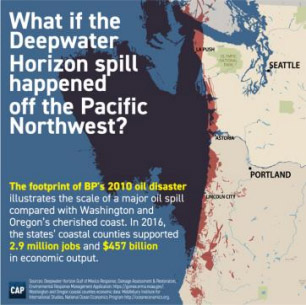
- Visuals help convey numbers, size and scale: Do the math for your audience. Statistics and big numbers will be meaningless to people unless you give them an analogy or comparison by which they can judge the numbers. For example, compare the size of an oil spill to a U.S. state. Infographics are a great way to do this, and they are a prime vehicle to share your science on social media.
Download your copy of this tipsheet here.